Over the last couple of years, Tor have introduced new cover art for
The Wheel of Time novels by Robert Jordan, presumably due to repeated complaints that the paper covers by Darrel K. Sweet are 'rather variable in quality' (that's being kind). Whilst for now the new art is restricted to the ebooks, it's assumed that they will be rolled out for the hard copies some time after
A Memory of Light is published at the end of 2012.
So are the new covers better than the old? Does Sweet get a bit of a rough deal? Let's check out the old covers and the new ones. This post will cover the first seven books in the series and obviously feel free to disagree with my choices in the comments.
I. The Eye of the World

The Darrell K. Sweet original. Simple, straightforward, even classic. Sure, strewn with ridiculously bizarre touches (Lan has been replaced by a samurai for no discernible reason) and it's very dated in style, but likable, and shows the content of the book pretty well: a bunch of people setting out on an adventure.

The ebook cover by Dave Grove. Avast, me hearties! A somewhat odd choice of image, of Rand clinging to the mast of Bayle Domon's ship as it passes down the Arinelle with the Tower of Ghenjei in the distance. Points for emphasising the Tower, but then it does so in a rather unsubtle manner. Focusing on Rand is good, but not showing his compatriots feels like a shame, especially since the Rand-Mat relationship is a key part of the novel and Mat is missing altogether. It's a good painting, but feels like an internal image from a deluxe illustrated edition rather than a summing-up of the content of the whole novel.
Winner: Sweet, by a nostalgic nose. This probably won't happen very often.
II. The Great Hunt

The original art for
The Great Hunt has become infamous over the years, mainly since it seems to mark the start of Sweet's bizarre insistence on painting Trollocs as normal guys with horned helmets rather than monstrous crossbreed creatures. Loial looks like a hairy Vulcan with thin legs, not really any taller than Rand, and Selene seems to be in a nightie. Not great.

Clever. Kekai Kotaki revisits the same image, but in a way that is notably less crap. The Trollocs look right and the human figures are more dramatic and interesting. I was thinking that some more of the new covers would revisit the old images and update them, but Tor clearly wanted to go in a new direction. Or didn't want to risk embarrassing Sweet any further.
Winner: The new cover, easily.
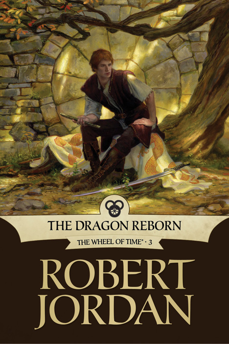
III. The Dragon Reborn

One of Sweet's better images, showing the iconic moment Rand al'Thor claims
Callandor, which marks him as the Dragon Reborn. This is a reasonable image, showing the Heart of the Stone, but Rand looks a bit neat considering the several months of harsh travel and life-and-death struggle he's gone through to get to Tear, whilst Perrin seems to inexplicably dropped by from a costume-fitting for a remake of
The Warriors. Despite these problems, I quite like this image, despite the absence here of Ishamael's burning face on the spine (which apparently gave Harriet - Robert Jordan's wife - nightmares).

The new artwork, this time by Donato Giancola, is...nice. A good-quality image of Rand, erm, chilling out on a tree somewhere. It's a good-quality image but lacks dynamism.
Winner: Sweet, surprisingly.
IV. The Shadow Rising

Rand and Mat, who appears to have transformed into a hobbit, chilling out on a tinker's cart in the Aiel Waste whilst, erm, someone makes tea (is that Moiraine or Egwene? Or someone completely different?). The environment art (more clearly seen on the back cover) is actually really good, but the cover image is weak.

The new cover art by Sam Weber is dark and moody, showing Mat in a sinister and ill-omened light contrasting his normal jovial depiction. Excellent.
Winner: The new cover, by about five light-years.
V. The Fires of Heaven

Mat, Rand and Aviendha get lost in Rhuidean whilst more not-Trollocs look on threateningly from the shadows ('the shadows' in this case being about three feet from Rand whilst he's looking straight at them). Pretty much nonsensical, especially given only a few chapters are set in Rhuiden.

Dan Dos Santos gives us Moiraine Damodred, badass channeller, laying down the law on Lanfear.
Winner: The new cover, most definitely. Moiraine's last stand is one of the more iconic scenes from the series and definitely worthy of a cover shot.
VI. Lord of Chaos

The aftermath of Dumai's Wells is a good image to go with, but not if you turn Rand into the cover hero from a Mills & Boon novel whilst a kneeling Aes Sedai swoons over him and a Draghkar flies overhead (not that any Draghkars are present at the battle, but whatever).

Greg Manchess paints some Agents from
The Matrix blowing up some attacking ninjas! Awesome! Explosions! Lightning! Men running around on fire! Yeaaah! And it has a bigger version!
 Winner:
 The new cover. It's a bit corny, to be honest, but also dynamic with lots of action.
VII. A Crown of Swords

Rand flexing his muscles in Shadar Logoth, as you do when Mashadar is floating two feet in front of you in a random pit. Not a great cover, but the detail on the buildings is quite nice. Plus this was the first hardcover novel I ever bought, so it has some nostalgia value for me.

The new cover, by Melanie Delon. It's a non-instinctive image from the book to go for. In fact, considering the book features the Seanchan storming the Fortress of the Light, a Seanchan fleet battling its way into Ebou Dar Harbour, the Shaido being scattered over the landscape and Rand bending the Sea Folk to his will (more or less), neither images are the most immediately obvious ones. This could have been made to work well, but here it doesn't. Nynaeve looks nothing like Nynaeve, Lan looks like a low-res character model from
Oblivion and both are straight out of the uncanny valley.
Winner: Sweet, disappointingly since his image isn't great either. But it makes a bit more sense and is a bit less oddball than the new one.
Half-Time Score: Sweet 3 - New Covers 4
Still all to play for in Part 2.